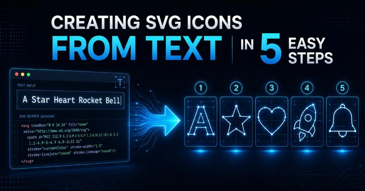
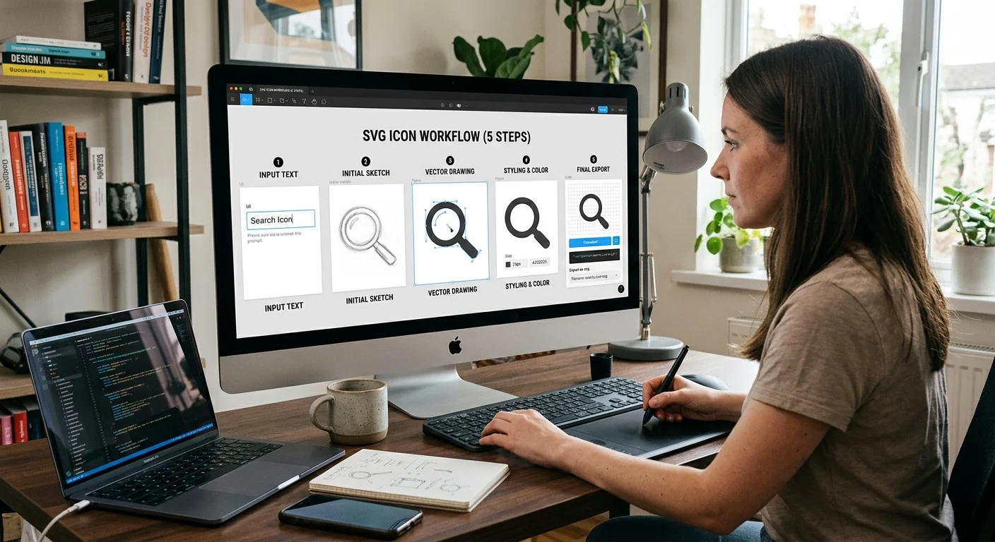
Creating SVG icons from text in 5 easy steps is more straightforward than most web designers and developers assume. If you've ever spent time hunting through icon libraries for the perfect symbol, only to settle for something close enough, you already know the frustration. The reality is that you can generate precise, custom SVG icons directly from text descriptions, and the process takes minutes rather than hours.
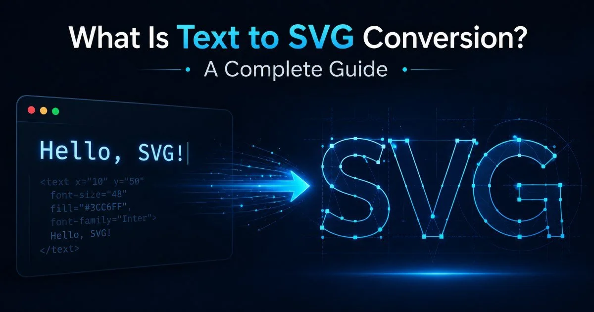
Scalable vector graphics are the backbone of modern web interfaces, offering crisp rendering at any resolution without the file bloat of raster alternatives. For a thorough overview of how this transformation works under the hood, our complete guide to text to SVG conversion covers the fundamentals.
This article gives you a repeatable, practical workflow you can start using today. By the end, you'll have a reliable five-step method for producing production-ready vector icons from simple text input.
Key Takeaways
- Text to SVG conversion turns plain descriptions into scalable vector graphics in seconds.
- Descriptive, specific text prompts produce significantly better icon results than vague ones.
- SVG output should always be optimized before deploying to production websites.
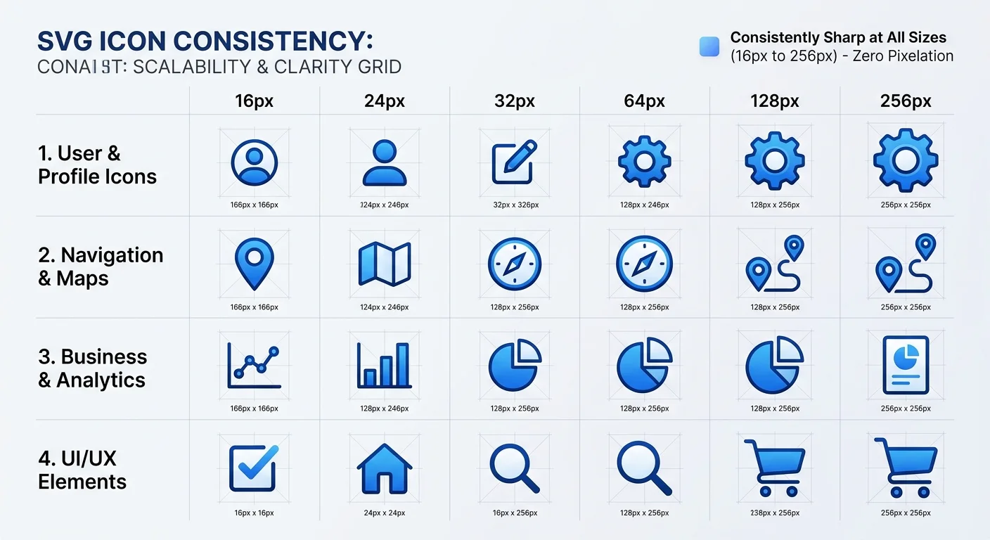
- Testing icons across multiple screen sizes confirms they render correctly everywhere.
- A consistent naming and organization system prevents icon library chaos over time.
Step 1: Define Your Icon Requirements
Before you type a single word into any SVG generator, you need to know exactly what you're building. Start by auditing your project's design system. What icon sizes does your UI use? Are you working with a 24px grid, a 32px grid, or something custom? These decisions affect stroke width, level of detail, and overall visual weight. Skip this step, and you'll waste time regenerating icons that don't fit your layout.
Consider the visual style your project demands. Outlined icons communicate a different tone than filled ones. Rounded corners feel friendlier than sharp edges. Your existing brand guidelines probably dictate some of these choices already. If you're unsure why scalable vector graphics beat raster images for this kind of work, the short answer is infinite scalability and tiny file sizes. Document your style decisions before moving forward.
Choosing Style and Dimensions
Create a brief specification sheet for your icon set. List the target viewBox dimensions (typically 0 0 24 24 for standard UI icons), the stroke width you prefer, your color palette, and any constraints like single-color compatibility. This reference document becomes your quality filter during generation. Every icon you produce gets checked against these specs before it enters your codebase.
Write your icon specs in a shared document so designers and developers reference the same standards throughout the project.
Think about context, too. Navigation icons behave differently from illustration icons. A tiny 16px favicon needs extreme simplicity, while a 48px feature icon can handle more complexity. Mapping each icon to its intended use case prevents the common mistake of generating overly detailed graphics that turn into blobs at small sizes. Specificity at this stage saves significant rework later.
Step 2: Write Precise Text Prompts
The quality of your text input directly determines the quality of your SVG output. Vague prompts like "settings icon" produce generic results. Specific prompts like "gear icon with six teeth, 2px stroke, rounded line caps, no fill, 24x24 viewBox" produce something you can actually use. Treat your text description as a design brief, not a casual request. The more constraints you provide, the closer the first result will be to your target.
Good anchor text quality matters for links, and the same principle of precision applies to icon prompts. Include the object, the style, the weight, and any distinguishing features. Mention what you don't want as well. "No background, no drop shadow, single path" eliminates common unwanted elements from the output. This practice of writing detailed prompts applies whether you're using a dedicated text to SVG tool or exploring broader AI image generators for visual assets.
Prompt Formulas That Work
A reliable prompt formula follows this pattern: object + style + stroke details + constraints. For example, "house icon, outline style, 2px uniform stroke, rounded joins, single continuous path, 24x24." Another strong pattern adds context: "shopping cart icon for e-commerce navigation bar, minimal line art, no fill color." These structured prompts consistently outperform one-word descriptions in generating usable vector graphics.
Build a prompt library as you go. When you find a text description that produces a great result, save it as a template. Swap out the object name for your next icon, and you maintain visual consistency across your entire set. Creating SVG icons from text in 5 easy steps becomes even easier when your second, third, and fourth icons only require changing a few words in a proven prompt template.
"Treat your text description as a design brief, not a casual request."
Step 3: Generate and Iterate With an SVG Generator
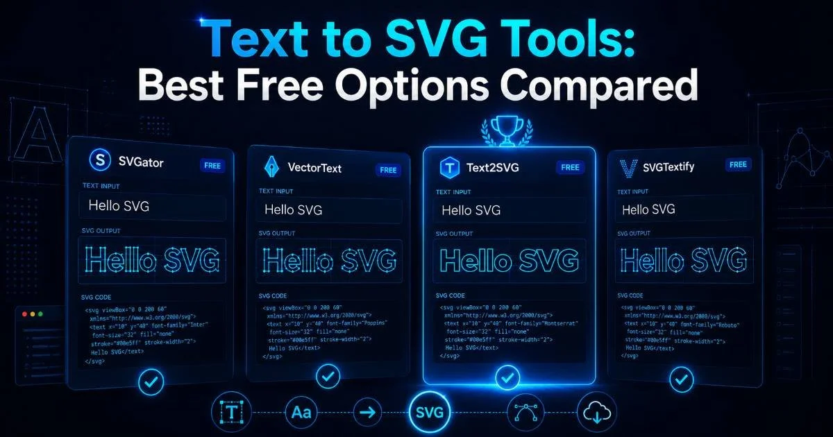
Now you take your refined prompts and feed them into an SVG generator. Tools like TXT To SVG handle the conversion from plain text to clean vector output. The generation step itself is fast, often producing results in seconds. Your first output might not be perfect, and that's expected. The goal is to get a strong starting point that needs minor refinement rather than a complete redesign.
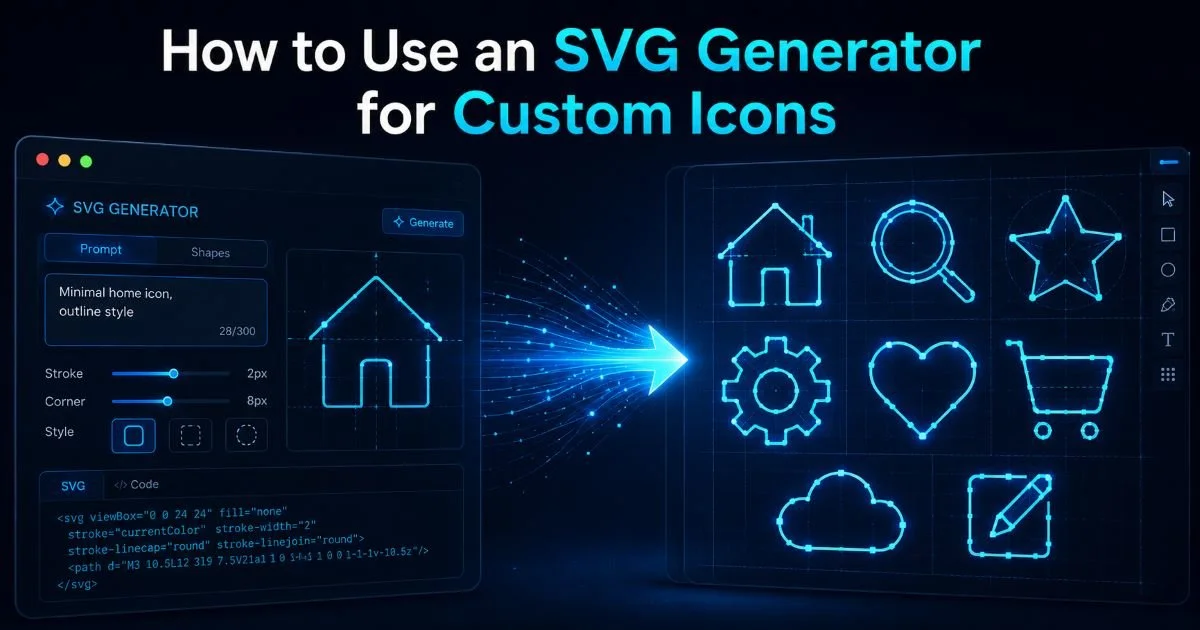
If you want a deeper walkthrough of the generation process specifically, our guide on how to use an SVG generator for custom icons covers the tool-specific details. Focus on evaluating each generated icon against the specification sheet you created in step one. Does the stroke width match? Is the viewBox correct? Does it look right at your target display size? These quick checks prevent bad icons from slipping into your project.
Comparing Generation Approaches
Different vector graphics tool options produce different results. Some generators output single-path icons ideal for font embedding. Others produce multi-element SVGs better suited for inline use with CSS styling. Understanding what your workflow needs helps you pick the right approach. For most web developers building UI icon sets, single-path output with configurable stroke is the sweet spot.
Expect to iterate. Even with a perfect prompt, you might need two or three generations to nail the exact look. Treat each iteration as refinement, not failure. Adjust one variable at a time, whether that's stroke width, corner radius, or overall complexity. This methodical approach converges on the right result faster than rewriting your entire prompt from scratch with each attempt.
Always inspect the raw SVG code after generation. Some tools embed unnecessary metadata, inline styles, or redundant group elements that inflate file size.
Step 4: Optimize and Integrate Your SVG Icons
Raw SVG output from any generator needs cleaning before it hits production. Tools like SVGO strip unnecessary attributes, collapse redundant groups, and minimize path data. This optimization step typically reduces file size by 20% to 60% without any visual change. For a site loading dozens of icons, those savings compound into measurably faster page loads. Never skip optimization, even if the generated file looks clean at first glance.
Our vector graphics tool guide for web developers covers the broader optimization landscape in detail. At minimum, remove any editor metadata, convert absolute paths to relative where possible, and set explicit width and height attributes alongside your viewBox. These steps improve cross-browser rendering consistency. Pay special attention to removing inline style blocks that some generators insert; external CSS classes give you far more control.
Optimization Checklist
Run through this sequence for every icon: strip metadata, run SVGO with default presets, verify viewBox dimensions, add accessible attributes (role="img" and an aria-label), and test at 1x, 2x, and 3x display densities. Creating SVG icons from text in 5 easy steps only works if you treat optimization as a non-negotiable part of the process rather than an afterthought. A beautiful icon that crashes Internet Explorer or renders blurry on high-DPI screens helps nobody.
Some optimization tools aggressively remove attributes needed for CSS targeting. Always test your icons with your actual stylesheets after optimization.
Integration depends on your stack. Inline SVG gives maximum control for styling and animation. An SVG sprite sheet works well for projects with 20+ icons that need efficient HTTP handling. Component-based frameworks like React benefit from SVG components that accept props for size and color. Pick the method that aligns with your architecture, and document it so your team follows the same pattern. Consistency in integration prevents the scattered icon mess that plagues many codebases.
Creating SVG icons from text in 5 easy steps wraps up with testing. View your icons in Chrome, Firefox, Safari, and Edge. Check them on actual mobile devices, not just browser emulators. Verify that your accessible labels read correctly with a screen reader. This final validation step catches the edge cases that desktop-only testing misses. Build testing into your workflow from the start and you will ship icons with confidence every single time.
Create a visual test page that displays every icon at 16px, 24px, 32px, and 48px side by side for quick visual QA.
Frequently Asked Questions
?How specific should my text prompt be for generating SVG icons?
?Can AI-generated SVG icons replace hand-coded ones from icon libraries?
?How long does it actually take to produce a production-ready SVG icon this way?
?What's the most common mistake when generating SVG icons from text descriptions?
Final Thoughts
Creating SVG icons from text in 5 easy steps is a practical workflow that any web designer or developer can adopt immediately. The process moves from defining requirements, through writing precise prompts, generating with a dedicated tool, optimizing the output, and validating across devices.
Each step builds on the previous one, so resist the temptation to skip ahead. Once you've built your first set of icons this way, you'll find the approach faster and more flexible than browsing generic icon libraries. Own your icons, and you own your design.
Disclaimer: Portions of this content may have been generated using AI tools to enhance clarity and brevity. While reviewed by a human, independent verification is encouraged.